这是一个位于南京市珠江路百脑汇旁边上不足60m²的小面积商铺,一个具有年代感的住宅楼下的商铺。建筑自身年代久远,狭长的空间相对复杂的结构存在,将是本次设计的难点。在解决这些问题的同时,将空间如何营造出一个纯粹温馨的面包加工坊,会是此次设计的重点。
This is a small area of less than 60m beside Buynow, zhujiang road, nanjing, and a shop downstairs with a sense of age. The architecture itself is old, and the existence of a relatively complex structure of narrow and long space will be the difficulty of this design. Solve these problems again at the same time, will the space how to build a pure and warm bread workshop, will make the focus of the design.
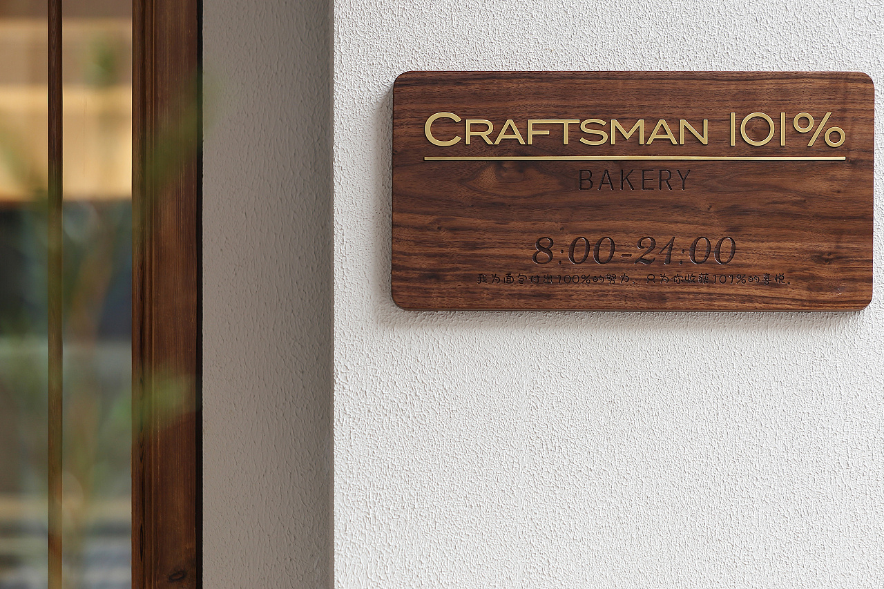
品牌标识·the brand
苏格设计秉承 craftsman 101% 品牌所坚持“带着匠人精神做更好吃的手工面包”朴质的经营哲学,在设计中,保持克制很重要。本着“自然生长”的理念,大面积肌理漆留白,纯实木黑胡桃的门牌加以点缀,借用未经修饰的天然元素点缀,创造虚实相生的体验空间来诠释品牌特质。
SuGe design follows craftsman\'s 101% brand philosophy of \"making better homemade bread with a craftsman\'s touch\" , where restraint is important and large areas of texture are painted white in the spirit of \"natural growth\" , pure solid wood black walnut door plate to embellish, borrow UNMODIFIED natural elements embellishment, create virtual and real experience space to explain the brand characteristics
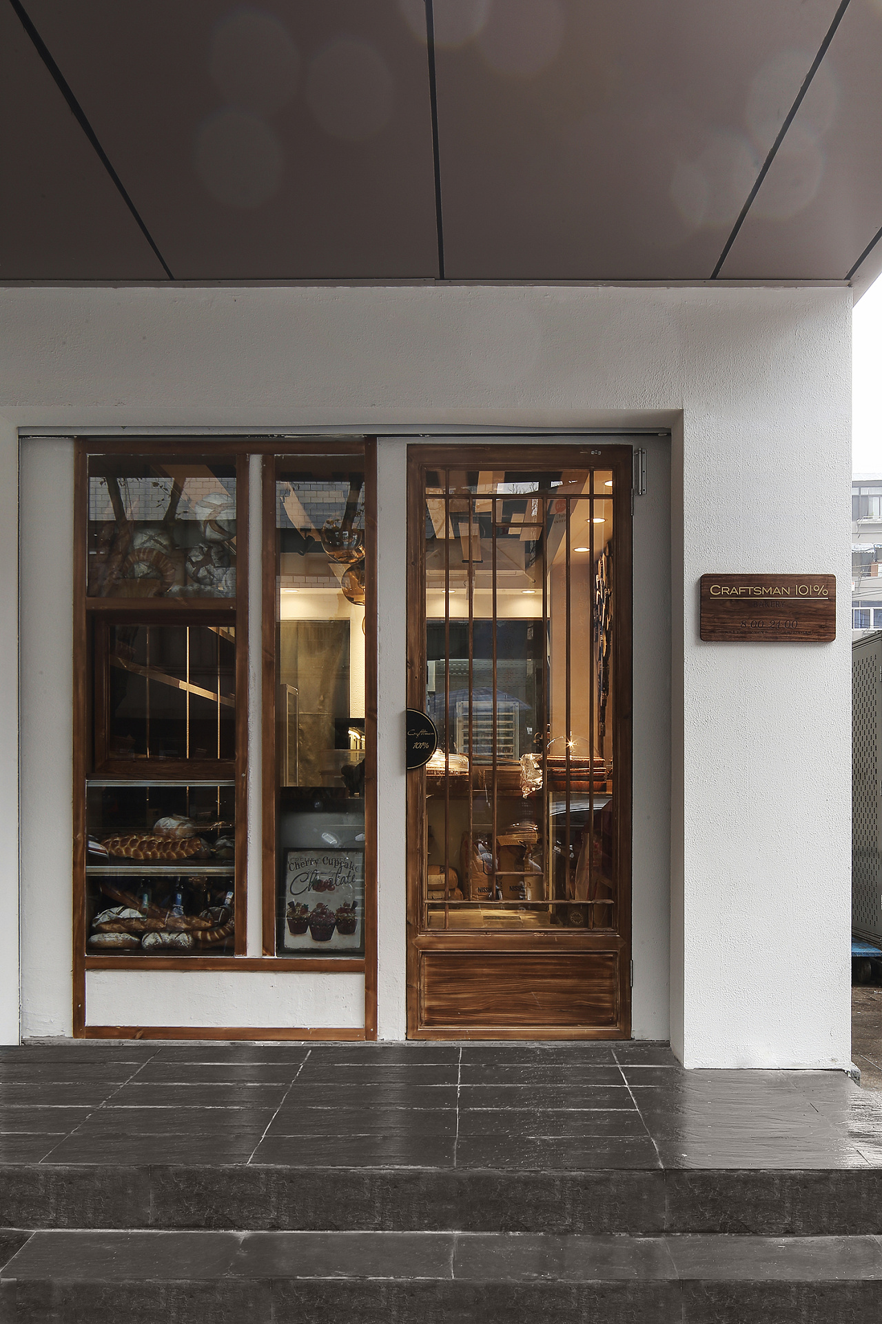
店面外观·store facade
就苏格设计团队对待项目而言,都是在撰写与众不同的故事,无关项目大小,旨在通过设计语言讲述一个品牌,一个日式面包坊对手工制作技艺的不懈追求,力求做到比完美还要多一分的极致匠人精神。
As far as SUGE\'s design team is concerned, it\'s all about telling a different story, regardless of the size of the project, about a brand, a Japanese bakery\'s relentless pursuit of craftsmanship through design language, the ultimate craftsman\'s spirit of striving for one more point than perfectio
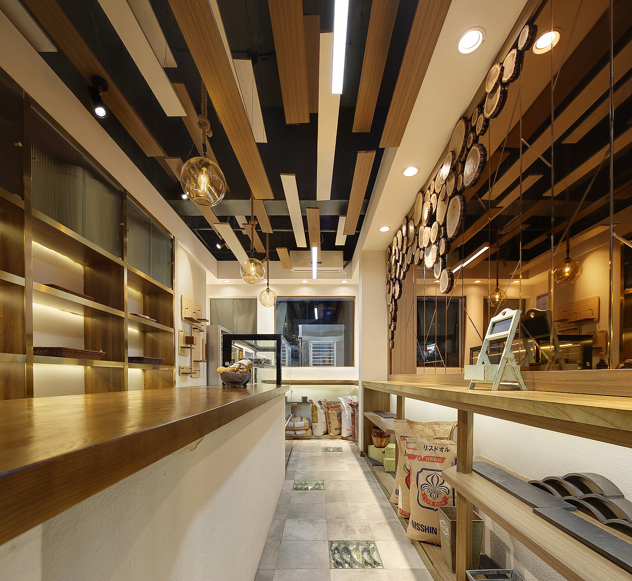
原生木料与留白·Native timber with white space
空间中取自天然复古的原生榆木料,浅灰色仿毛石地面,小空间则摒弃华丽且累赘的装饰,追求高度真实且单纯自然的美。营造温和感极强的空间氛围。
The space is made of natural and Retro Native Elm Wood, with light grey stone-like floors. The small space is free from ornate and cumbersome decorations, in pursuit of a highly authentic and pure natural beauty. Create a very warm feeling of space atmosphere

空间演变概念图·Concept map of spatial evolution
针对原始空间其狭长且缺少自然光的不利因素,设计上引入BOX的体块组合,使得内部空间具有一定的逻辑性,高地错落的榆木板造型提升空间的趣味性。
Aiming at the disadvantage of the long and narrow space and the lack of natural light, BOX is introduced into the design, which makes the interior space have certain logic and enhances the interest of the space

原生榆木年轮概念图·Concept map of wood with primary ring
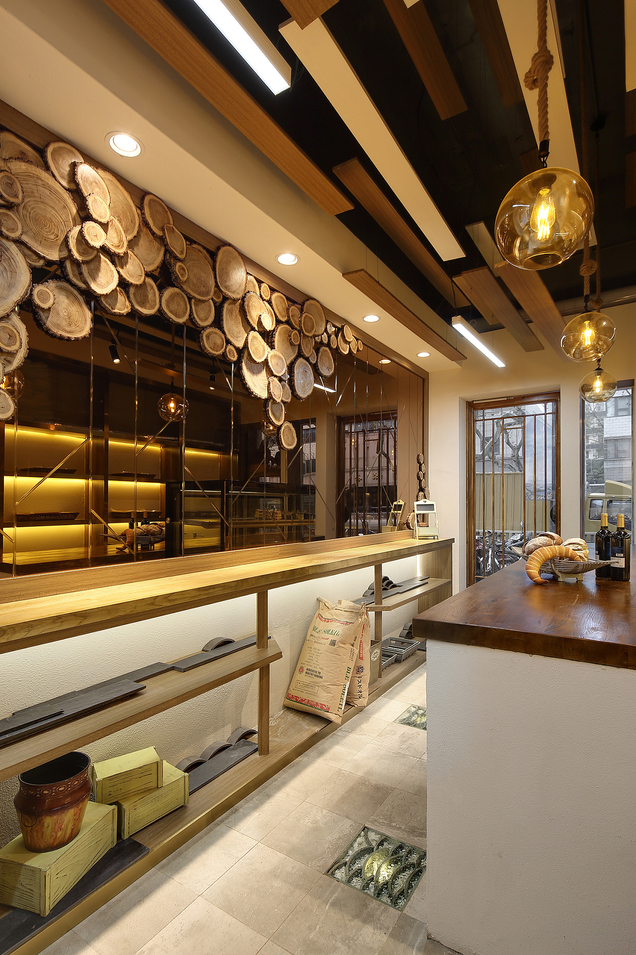
墙面茶镜增加空间层次感·Mirrors add a sense of spatial hierarchy
相对狭窄的过道采用茶镜提升空间的层次感,茶镜对光的反射面相对较柔和,同时竖向分割线与原生榆木料的逻辑性也传达着聚木成林的意境。
Relatively narrow corridor USES tea mirror to enhance the sense of hierarchy of the space, the reflection surface of the tea mirror to light is relatively soft, at the same time the logic of the vertical dividing line and native elm wood also conveys the artistic conception of gathering wood into forest.


细部·detailed view


吧台白色肌理漆的颗粒质感与老榆木台面的特殊纹理感旨在让人体验到素雅,亲和,如自然呼吸般的存在的空间。
The grain texture of the white texture paint of the bar and the special texture feeling of the old Elm table are designed to let people experience the space of unsophisticated, affable, like natural absorptio


